Petrie Partners is a boutique investment bank focused on the oil and gas industry. The team is an elite group of industry veterans, led by namesake Tom Petrie. Despite its size, the firm competes with some of the largest banks on The Street—and often wins.
The Challenge
Petrie Partners was a fledgling firm when it engaged SPINE. Our first task was to answer the question, “What is the face of the Petrie brand?” Once that was defined, we moved on to building and reinforcing the new brand. Marketing efforts initially focused on generating awareness, and then shifted to keeping Petrie top-of-mind as the firm quickly established itself as a leader in the oil and gas space.

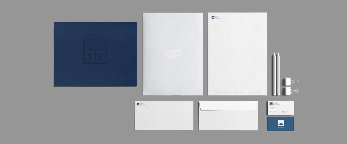
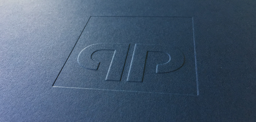
Corporate Identity
The executive team had worked as a group for years at several different firms. When they came together to form Petrie Partners, they wanted a logo that would convey core strengths and character traits such as professionalism, integrity, and expertise. An added dimension was Tom Petrie’s avid interest in Western artwork. Drawing upon all these elements for inspiration, we developed a bold and powerful logo. Much of its visual strength comes from the symmetry of the two Ps, which evoke both a bull’s head and the top of a classical column.
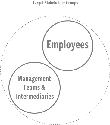
Stakeholders:
Management Teams & Intermediaries
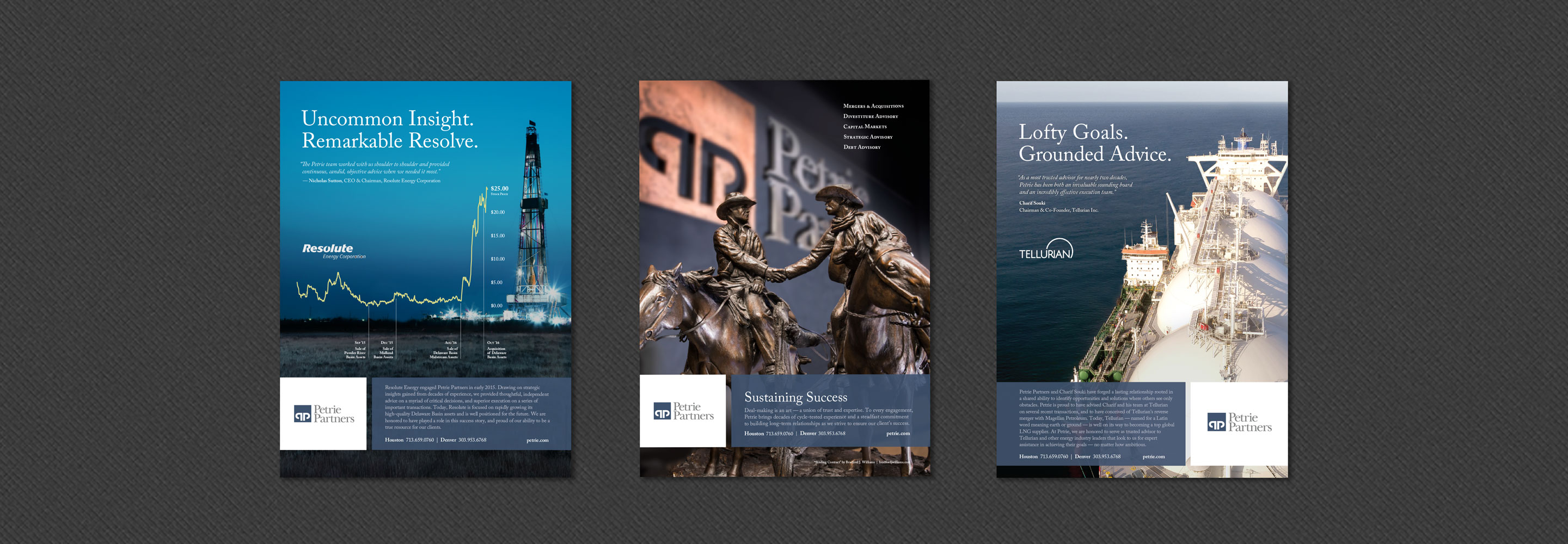
Investment bankers are dealmakers. They require an extensive network of contacts to perform their craft. In an industry that revolves heavily around relationships and reputations, success builds on itself. However, that doesn’t eliminate the need for marketing. The first pieces we developed for Petrie touted the team’s lengthy track record and recent deals, establishing credibility and conveying stability in a volatile market. Once the marketplace understood the Petrie story, we developed simpler pieces that reinforced Petrie’s leadership position and kept the name in front of prospective clients and intermediaries.