
Asset managers typically focus on strength and stability when establishing their brand identity. And that makes sense—after all, they are charged with securing their clients’ financial futures and want investors to feel confident in their choice.
But that desire to appear strong and steady can make it challenging for firms to stand out from the competition. With so many managers telling the same story, how can an investor know which one to choose? At the same time, straying too far from accepted norms in financial branding can diminish your credibility with your target market.
Whether you’re launching a new brand or updating an existing one, it is important to understand those norms. Then you can make an informed decision on how much to adhere to or deviate from them.
Below are some observations we would like to share, based on our extensive experience working with asset managers and other financial clients. These are some of the branding conventions we have seen in the industry; they are not necessarily strictures that must be followed, but rather commonalities that have emerged over the years.
Color choices – A quick glance at the top financial services companies and you’ll see that many choose variations of blue for their website design and other branded materials, including 10 of the 20 largest global asset managers for 2018 as compiled by Investment & Pensions Europe. And there’s a good reason for that, since blue inspires trust and conveys dependability and strength. It’s also the most popular color among men (57%) and women (35%). (Type “blue” into Pantone’s ColorFinder and you’ll find 100 variations.)
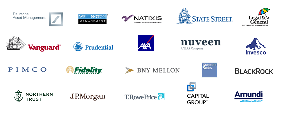
Images – Some common themes for images that financial firms use to establish a brand identity are nautical (bridges, lighthouses), structural (columns, city skylines), and environmental (mountains, plants, trees, sky)—implying concepts such as strength, direction, movement, growth, and health. This type of imagery is usually used as a secondary branding element, but may sometimes appear in the identity. Look at the logos above—see any common themes?

Typefaces and fonts – Professional and financial services companies use serif typefaces such as Times New Roman, Garamond, and Franklin Gothic far more than sans serif fonts, since they are seen as more conservative, traditional, and formal.
Physical manifestation – For asset managers, this primarily refers to the printed materials that provide a tactile representation of your brand identity. From cotton or linen paper complete with watermarks to thermography (raised type) and engraving, the heavier and higher quality the materials, the stronger the message of success and prestige.
Everything from your print materials to your digital presence should work together to reinforce your distinctive brand identity, yet fit within acceptable parameters. That’s no easy task, given all the options and decisions. Make sure you work with a branding agency that understands the financial space and can push the limits in an acceptable manner without compromising your credibility.
Whether you’re a startup seeking to build a brand or an established firm that needs a refresh, SPINE can help you through the process. Contact us now to start the conversation.